Plotting
Available Base plots
First we define a Dataset like we have done in Quickstart and Tutorial.
When we score the estimator by calling score_estimator(), we get a
Result back, which contains a number of handy plotting features.
To use the visualizations, access them using the .plot accessor on the
Result object:
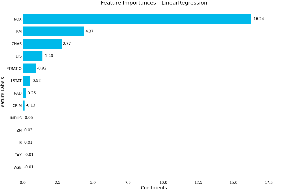
(Source code, png, hires.png, pdf)

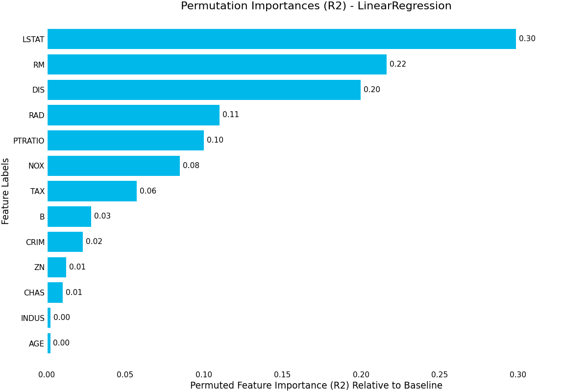
(Source code, png, hires.png, pdf)

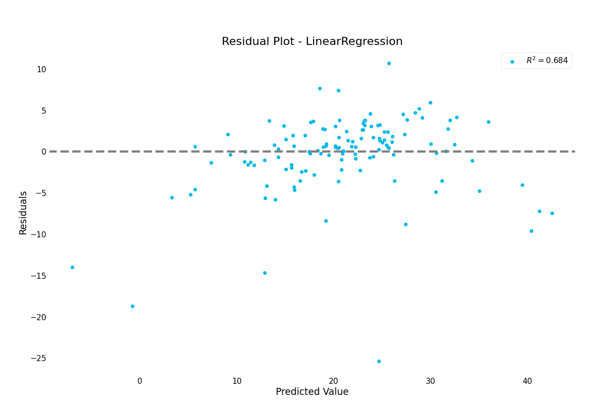
>>> result.plot.residuals()
(Source code, png, hires.png, pdf)

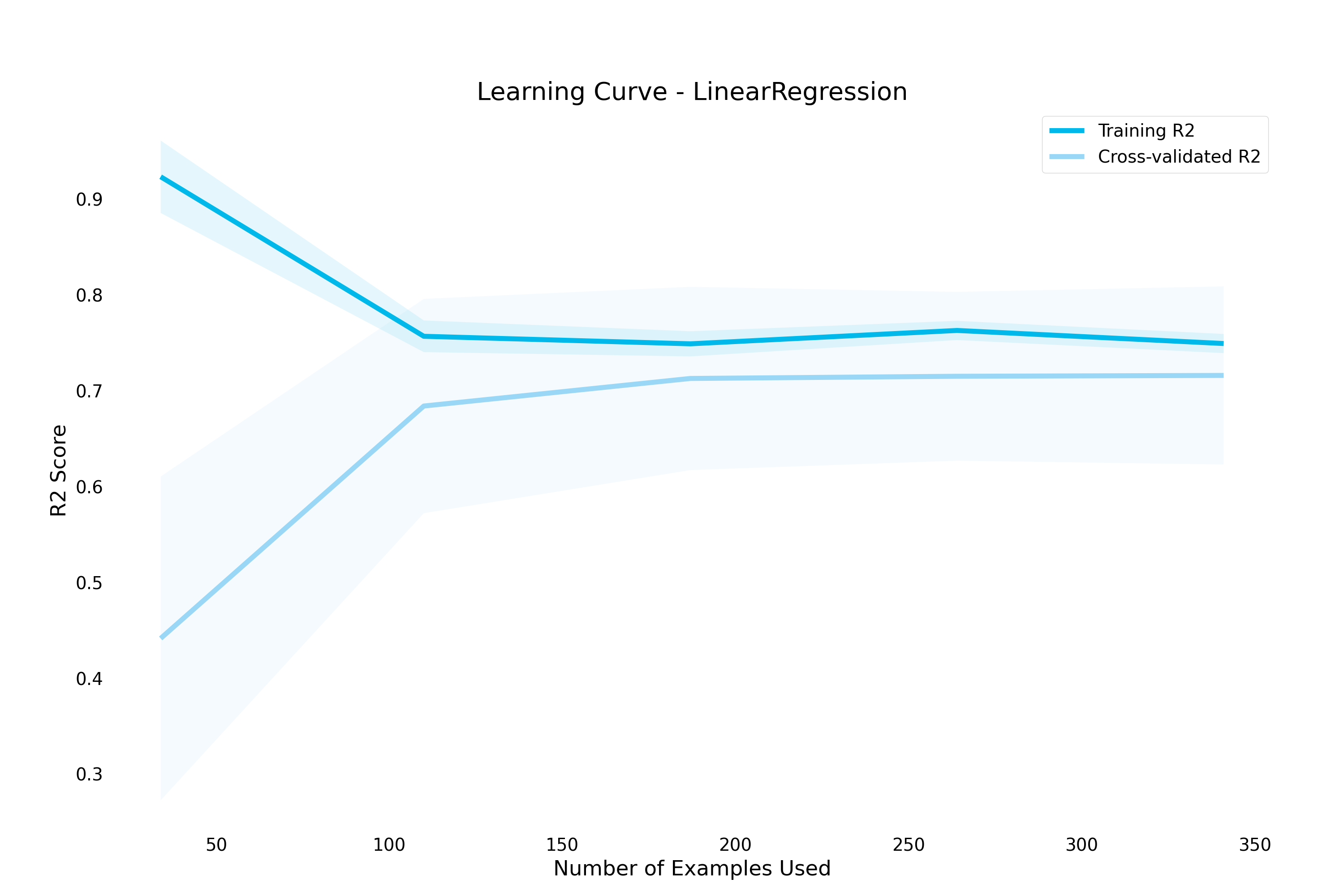
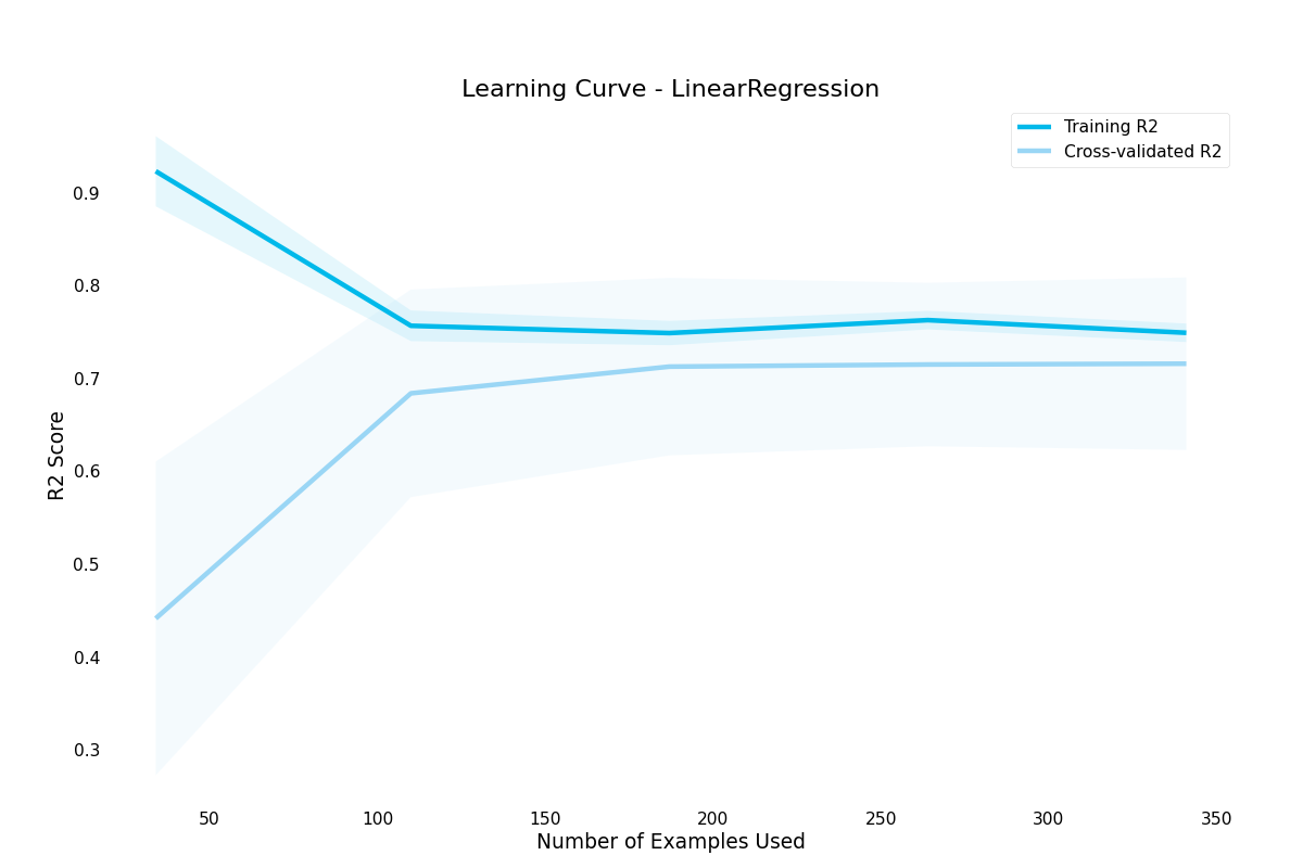
>>> result.plot.learning_curve()
(Source code, png, hires.png, pdf)
Any visualization listed here also has a functional counterpart in ml_tooling.plots.
E.g if you want to use the function for plotting a confusion matrix without using
the Result class
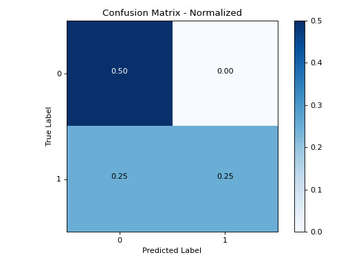
>>> from ml_tooling.plots import plot_confusion_matrix
These functional counterparts all mirror the sklearn metrics api, taking y_target and y_pred as arguments:
>>> from ml_tooling.plots import plot_confusion_matrix
>>> import numpy as np
>>>
>>> y_true = np.array([1, 0, 1, 0])
>>> y_pred = np.array([1, 0, 0, 0])
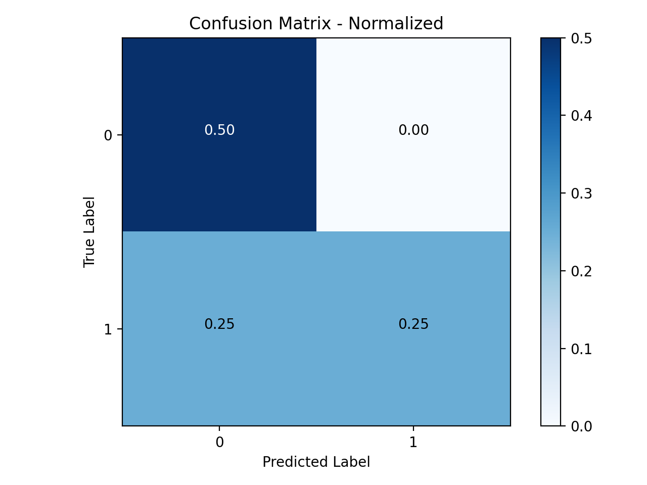
>>> plot_confusion_matrix(y_true, y_pred)
(Source code, png, hires.png, pdf)

Available Base plots
feature_importance()- Uses the estimator’s learned coefficients or learned feature importance in the case of RandomForest to plot the relative importance of each feature. Note that for most usecases, permutation importance is going to be more accurate, but is also more computationally expensive. Pass a class_index parameter to select which class to plot for in a multi-class setting
permutation_importance()- Uses random permutation to calculate feature importance by randomly permuting each column and measuring the difference in the model metric against the baseline.
learning_curve()- Draws a learning curve, showing how number of training examples affects model performance. Can also be used to diagnose overfitting and underfitting by examining training and validation set performance
validation_curve()- Visualizes the impact of a given hyperparameter on the model metric by plotting a range of different hyperparameter values
Available Classifier plots
roc_curve()- Visualize a ROC curve for a classification model. Shows the relationship between the True Positive Rate and the False Positive Rate. Supports multi-class classification problems
confusion_matrix():- Visualize a confusion matrix for a classification model. Shows the distribution of predicted labels vs actual labels Supports multi-class classification problems
lift_curve()- Visualizes how much of the target class we capture by setting different thresholds for probability. Supports multi-class classification problems
precision_recall_curve()- Visualize a Precision-Recall curve for a classification estimator. Estimator must implement a predict_proba method. Supports multi-class classification problems
Available Regression Plots
prediction_error():- Visualizes prediction error of a regression model. Shows how far away each prediction is from the correct prediction for that point
residuals():- Visualizes residuals of a regression model. Shows the distribution of noise that couldn’t be fitted.
Data Plotting
Dataset also define plotting methods under the .plot accessor.
These plots are intended to help perform exploratory data analysis to inform the choices of preprocessing and models
These plot methods are used the same way as the result plots
(Source code, png, hires.png, pdf)

Optionally, you can pass a preprocessing Pipeline to the plotter to preprocess the data
before plotting. This can be useful if you want to check that the preprocessing is handling all the NaNs, or
if you want to visualize computed columns.
Available Data Plots
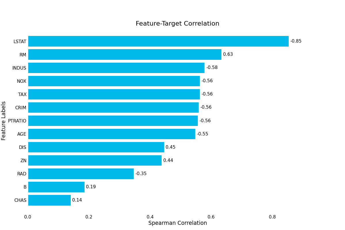
target_correlation():- Visualizes the correlations between each feature and the target variable. The size of the correlation can indicate important features, but can also hint at data leakage if the correlation is too strong.
missing_data():- Visualizes percentage of missing data for each column in the dataset. If no columns have missing data, will simply show an empty plot.
Continue to Transformers